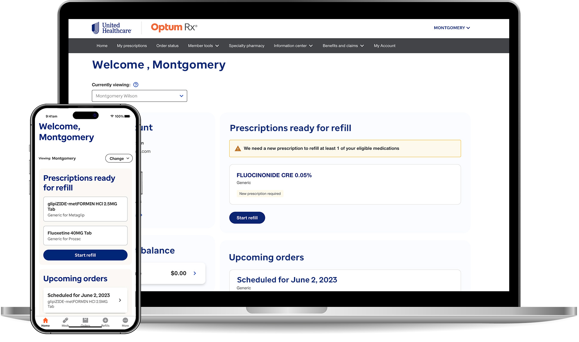
Optum Rx Mobile App
The Optum Rx mobile app provides users with a seamless way to manage their prescriptions and healthcare needs. It offers convenient features like easy prescription refills, medication reminders, and a pharmacy locator to find nearby pharmacies. Users can also access digital ID cards, track their order history, and compare medication prices for cost savings.
The Optum Rx mobile app provides users with a seamless way to manage their prescriptions and healthcare needs. It offers convenient features like easy prescription refills, medication reminders, and a pharmacy locator to find nearby pharmacies. Users can also access digital ID cards, track their order history, and compare medication prices for cost savings.
My Role - Designer, Collaborator, Director
_ Worked closely with product and dev teams to solve business objective
_ Led team of designers through UX iterations, UI implementation, user testing scenarios, accessibility audits and finally adjustments and launch Team Process + Goals
_ Focus on UX patterns, and testing design directions with research team
_ Interpret business objects for features with product teams, and guide UX/UI designers
_ Work towards feature "smart parity" with our web and mweb teams
_ Adjust expectations based on often required phased approach to feature completion
_ Get an MVP feature to makret, gather feedback, iterate, update, relaunch
_ Keeping my peer leadership team and senior leadership team in the loop and work through product challenges Core KPI
• Increase Biometrics login rate
• Increase Order Placed Completion rate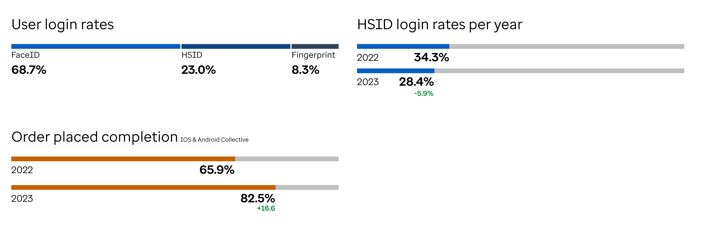 Mobile Application
The Optum Rx mobile app offers a range of features designed to streamline prescription and healthcare management. Key features include easy prescription refills, medication reminders, and a pharmacy locator to find nearby pharmacies. Users can also access digital ID cards, track their order history, and compare medication prices to find cost-effective options.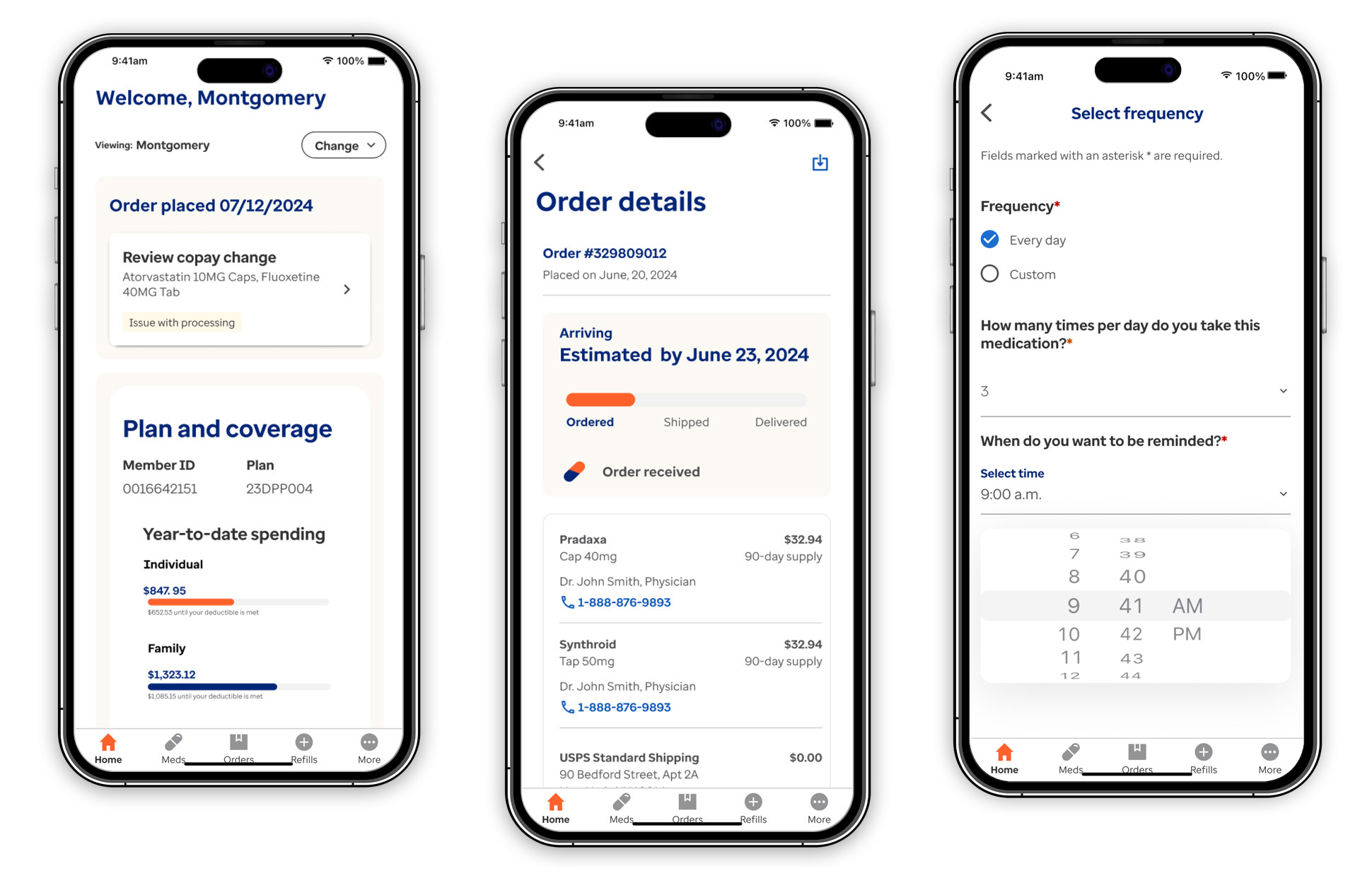 Figma + Native Component Library
A robust and comprehensive design style guide is essential for ensuring consistent UX patterns, accessibility, and UI elements. A Figma library provides the design team with easily accessible assets to incorporate into their designs, streamlining the collaboration process with development teams. Additionally, the team closely collaborated with development teams during the creation of coded components, ensuring they were thoroughly QA'd against the provided design specifications.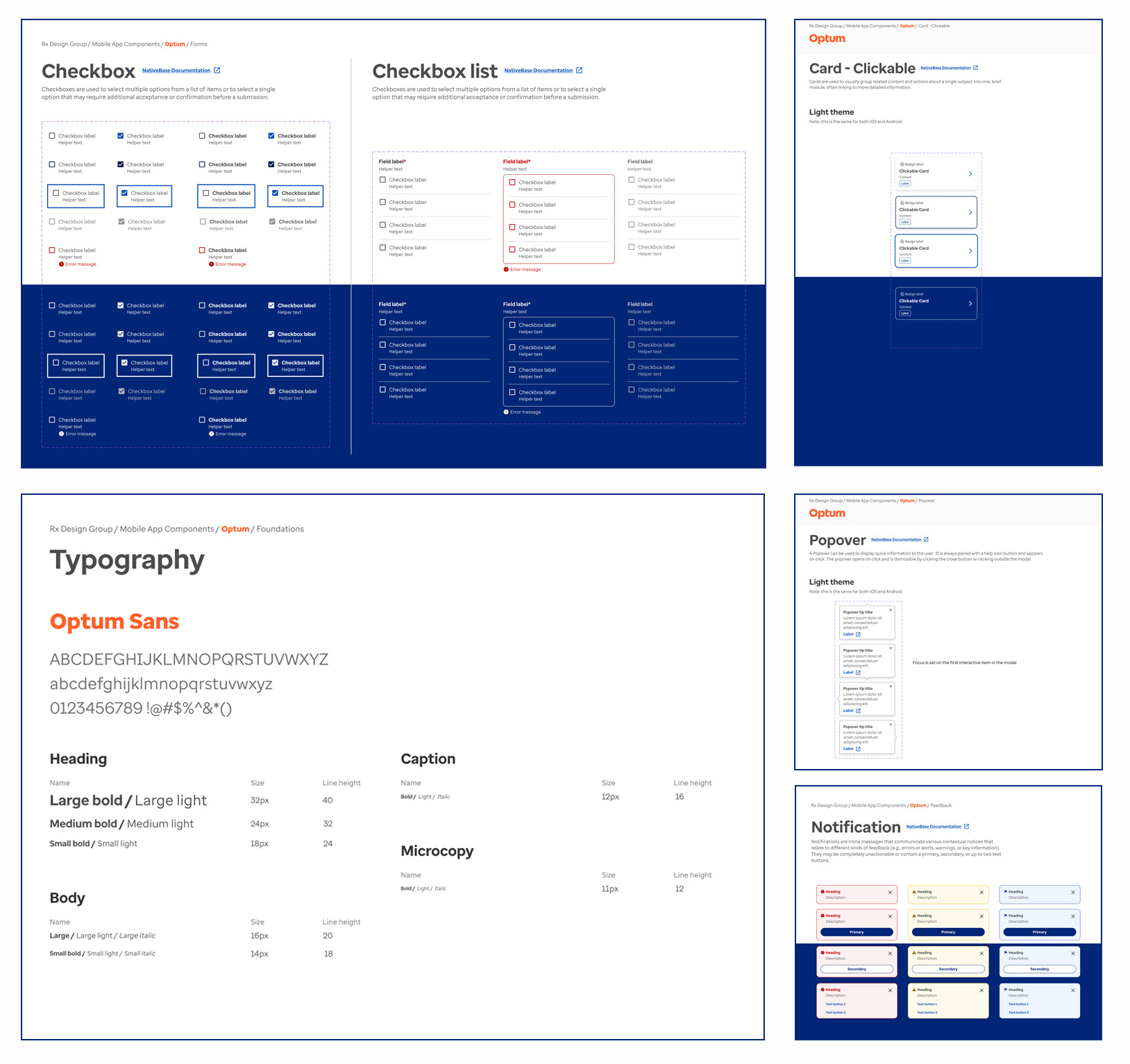 Smart Parity
As a product organization we prioritized achieving parity as a goal for the remainder of the year, aiming to better align the mobile app experience and UI patterns with our web and web-responsive experience. The current native approach has been hampered by development resources and product priorities, so I advocated for a quick win with a web-wrapped experience, allowing the application to quickly align with new features or enhancements completed by the web team.
When a higher level of parity is achieved, I plan to focus on "smart parity," considering user behavior and interactions with their devices. This involves examining the primary actions users take on mobile devices compared to laptops or tablets, including gestures, biometric authentication, and camera interactions.
_ Worked closely with product and dev teams to solve business objective
_ Led team of designers through UX iterations, UI implementation, user testing scenarios, accessibility audits and finally adjustments and launch Team Process + Goals
_ Focus on UX patterns, and testing design directions with research team
_ Interpret business objects for features with product teams, and guide UX/UI designers
_ Work towards feature "smart parity" with our web and mweb teams
_ Adjust expectations based on often required phased approach to feature completion
_ Get an MVP feature to makret, gather feedback, iterate, update, relaunch
_ Keeping my peer leadership team and senior leadership team in the loop and work through product challenges Core KPI
• Increase Biometrics login rate
• Increase Order Placed Completion rate
 Mobile Application
The Optum Rx mobile app offers a range of features designed to streamline prescription and healthcare management. Key features include easy prescription refills, medication reminders, and a pharmacy locator to find nearby pharmacies. Users can also access digital ID cards, track their order history, and compare medication prices to find cost-effective options.
 Figma + Native Component Library
A robust and comprehensive design style guide is essential for ensuring consistent UX patterns, accessibility, and UI elements. A Figma library provides the design team with easily accessible assets to incorporate into their designs, streamlining the collaboration process with development teams. Additionally, the team closely collaborated with development teams during the creation of coded components, ensuring they were thoroughly QA'd against the provided design specifications.
 Smart Parity
As a product organization we prioritized achieving parity as a goal for the remainder of the year, aiming to better align the mobile app experience and UI patterns with our web and web-responsive experience. The current native approach has been hampered by development resources and product priorities, so I advocated for a quick win with a web-wrapped experience, allowing the application to quickly align with new features or enhancements completed by the web team.
When a higher level of parity is achieved, I plan to focus on "smart parity," considering user behavior and interactions with their devices. This involves examining the primary actions users take on mobile devices compared to laptops or tablets, including gestures, biometric authentication, and camera interactions.
